⚡
Built for Fashion
Editorial layouts, lookbook heroes, shoppable media, and product galleries designed for apparel brands.
Everything you need to install, customize, and launch Klyro — a premium Shopify theme built for clothing & fashion brands.
Welcome to Klyro. This guide walks you through installation, theme editor basics, and the most important settings to configure before launch.
Editorial layouts, lookbook heroes, shoppable media, and product galleries designed for apparel brands.
Flexible color scheme system applied per section. Customize globally in Theme Settings → Colors.
Every section, header, cart drawer, and product layout is optimized for mobile, tablet, and desktop.
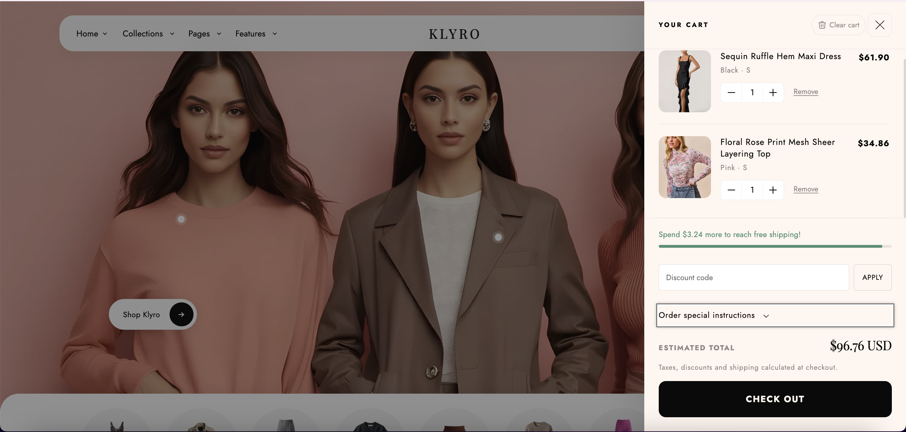
Free shipping bar, discount codes, and collection shortcuts built into the cart experience.
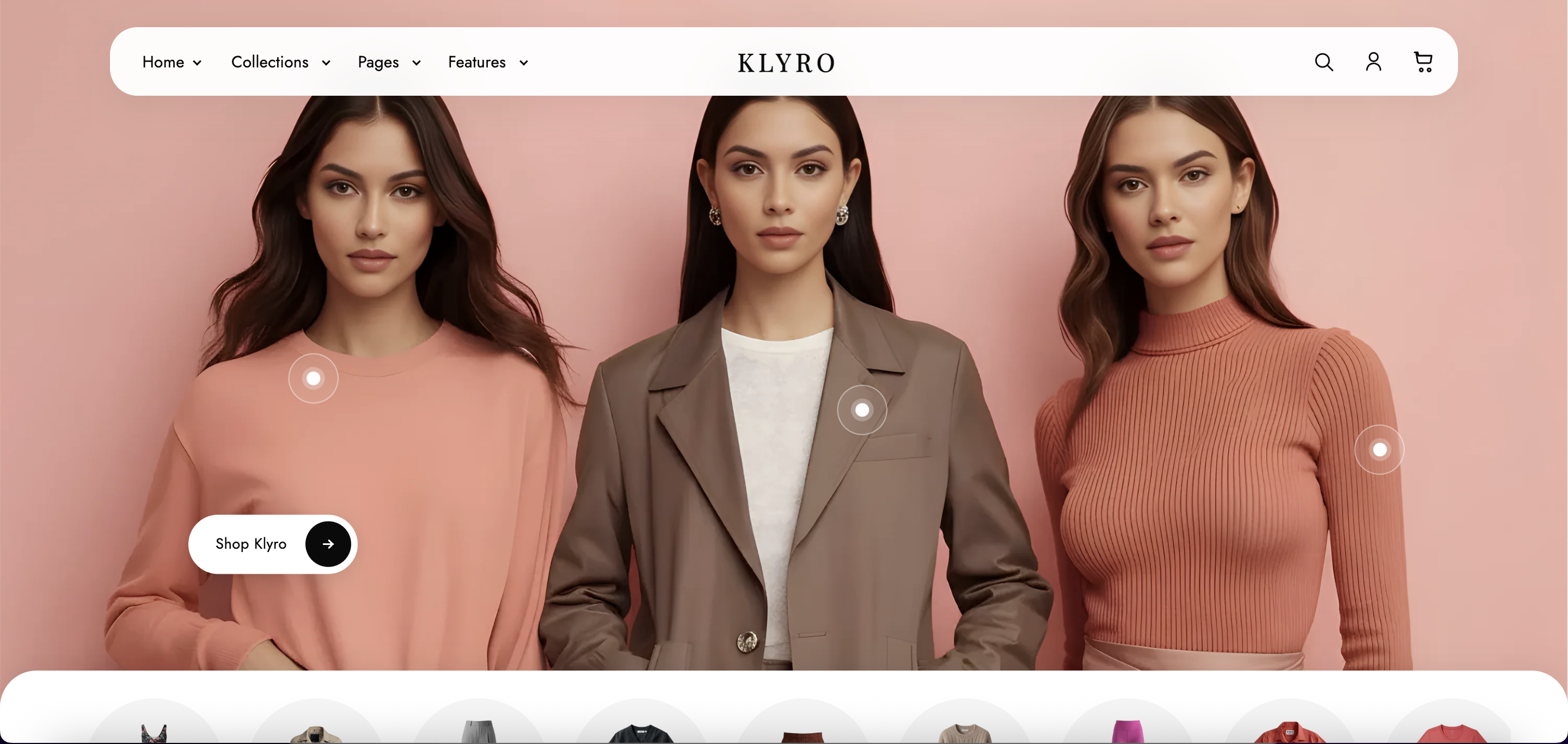
Install Klyro from the Shopify Theme Store or upload the theme ZIP manually.
shopify theme dev --store your-store.myshopify.com
Klyro is built on Shopify's Skeleton Theme foundation with a fully custom klyro-* component system.
| Directory | Purpose | Count |
|---|---|---|
sections/ | Page sections — editable in theme editor | 51+ |
snippets/ | Reusable Liquid partials | 70+ |
templates/ | JSON page templates | 25 |
assets/ | CSS, JS, SVG icons | 100+ |
config/ | Theme settings schema & defaults | 2 |
locales/ | Translation files (20+ languages) | 20+ |
layout/ | theme.liquid — global shell | 1 |
klyro-[name].liquid — e.g. klyro-featured-products.liquidsection-klyro-[name].css or klyro-[name].cssklyro-[name].js — loaded with deferklyro- prefix — e.g. klyro-fp__cardGlobal header and footer are managed via section groups, not individual page templates:
sections/header-group.json → klyro-header + klyro-utility-barsections/footer-group.json → klyro-footerGlobal settings are found in the theme editor sidebar under Theme settings. These apply store-wide.
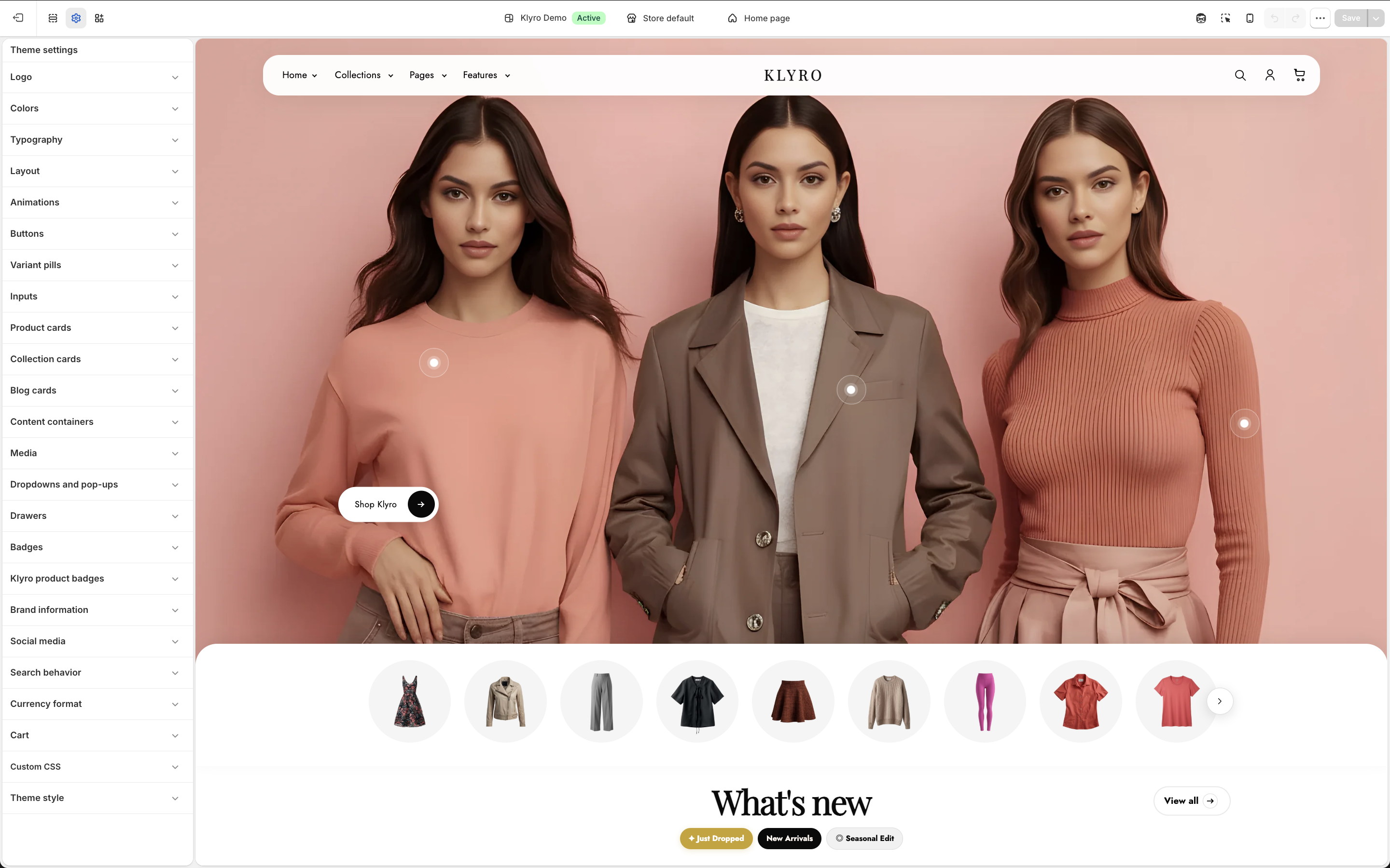
| Group | Key Settings |
|---|---|
| Logo | Logo image, width (50–300px), favicon |
| Colors | 5 color schemes — background, gradient, text, button, shadow |
| Typography | Heading & body fonts, scale (100–150%) |
| Layout | Page width (1000–1600px), section spacing, grid gaps |
| Animations | Scroll reveal on/off, hover animations |
| Buttons & Inputs | Border thickness, radius, shadow |
| Product Cards | Style (standard / klyro-card), padding, alignment, color scheme |
| Klyro Product Badges | Position, max count, auto sale/limited/new badges, custom labels & colors |
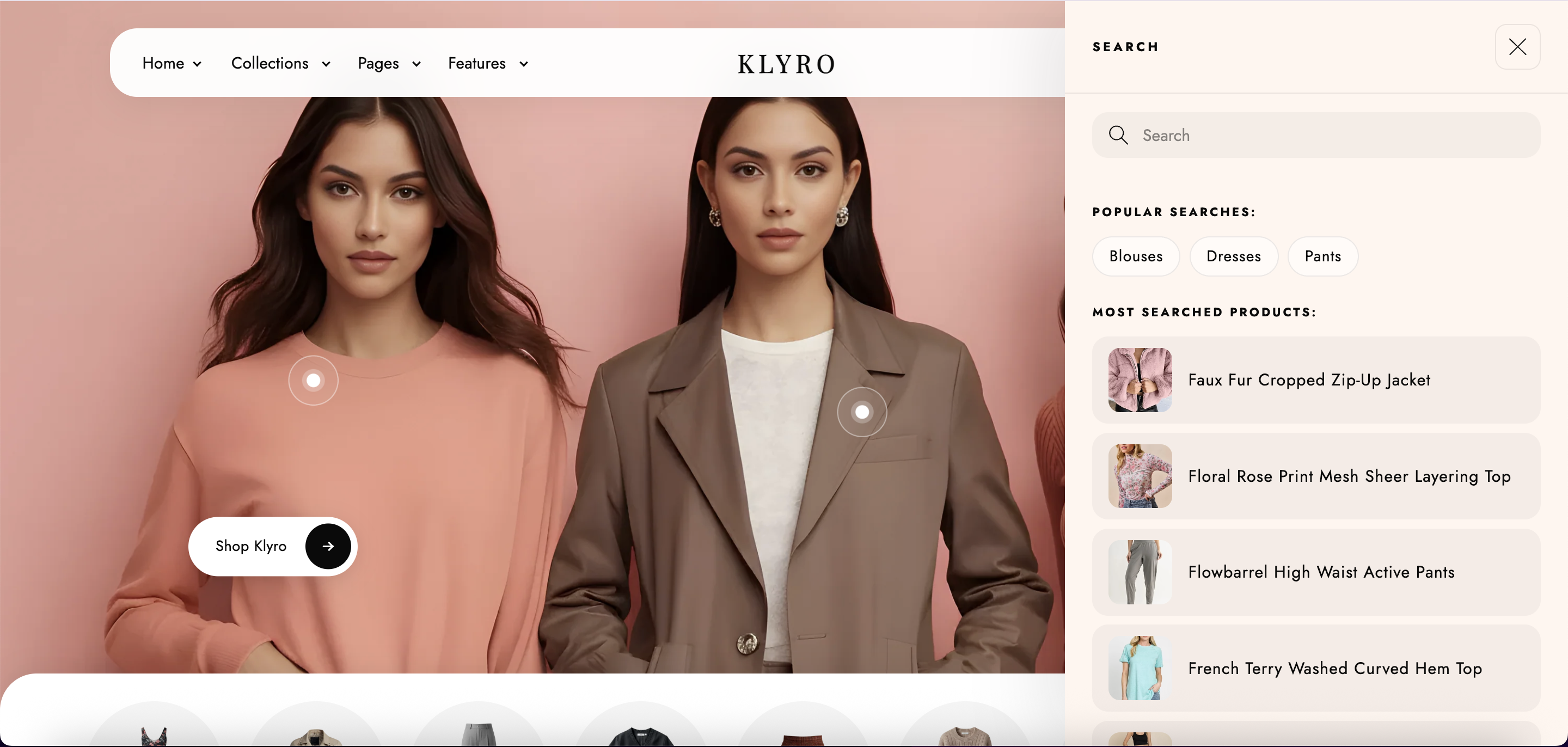
| Search | Predictive search on/off, show vendor & price in results |
| Cart | Cart type (drawer/page/notification), free shipping bar, discount codes, tax note, empty collection |
| Social Media | Platform URL fields (Instagram, TikTok, etc.) |
Badges appear on all product cards automatically. Configure in Theme settings → Klyro product badges.
new, hot, popular, bestseller, or klyro-badge:Your Label to any productAll 48 Klyro sections include written step-by-step instructions for the Shopify theme editor (Online Store → Themes → Customize), plus optional screenshots. Click a screenshot to open the viewer — click again to zoom in and drag to inspect small details.
sections-data.js together with index.html and script.js or written guides will not appear.
Many Klyro sections support blocks — sub-components you can add, remove, and reorder within a section.
| Section | Block Types | Notes |
|---|---|---|
| Klyro Header | left_link, right_link, mega_menu, mega_promo_card, store_notification, @app | Mega menu blocks define promo banners |
| Klyro Footer | link_list | Up to 4 menu columns |
| Product (v1/v2/v3) | accordion, video_feedback, custom_liquid, @app | Accordion panels use metafields |
| Lookbook Hero | hotspot | Position with x/y % coordinates |
| Shoppable Image | hotspot | Links to a product at x/y position |
| Customer Reviews | review | Avatar, rating, quote, author name |
| Marquee Ribbon | text, badge, separator | Mix text and badge chips |
| Collection Page | badge | Banner badge pills |
| Product Trust Bar | badge | Icon, title, subtitle, optional link |
| Scrolling Cards | subheading, heading, badge, image_card | Layered card content |
Each accordion block maps to a panel on the product page. Content priority:
Klyro uses JSON templates. Each template defines which sections appear on a given page type.
| Template | Primary Sections |
|---|---|
index.json | Full homepage stack (14 sections) |
product.json | Product Slide (v3) + reviews + trust bar + newsletter |
product.v1.json | Product Atelier — 2-column gallery |
product.v2.json | Product Grid — stacked gallery |
product.v3.json | Product Slide — horizontal gallery |
collection.json | Collection Page + newsletter |
cart.json | Cart Page + merchandising sections |
search.json | Search Page + merchandising |
blog.json / article.json | Blog grid + article layout |
page.about-us.json | About Hero section |
page.contact.json | Contact page with form & map |
page.faq.json | FAQ Hero + FAQ accordion |
customers/*.json | Login, register, account, orders, addresses |
404.json | 404 Hero with tag links |
password.json | Password page for pre-launch stores |
Snippets are reusable Liquid partials. They are not editable in the theme editor but power the theme's core functionality.
| Group | Key Snippets |
|---|---|
| Header / Nav | klyro-header-menu, klyro-header-drawer, klyro-mega-menu-panel, klyro-search-drawer |
| Product PDP | klyro-product-gallery, klyro-product-buy-form, klyro-product-variant-picker, klyro-product-accordions |
| Product Cards | klyro-cp-card, klyro-tabs-product-card, klyro-cds-product-card |
| Cart | klyro-cart-drawer, klyro-cart-line-item, klyro-cart-shipping-bar, klyro-cart-discount-form |
| SEO / Meta | klyro-meta-tags, klyro-breadcrumbs |
| Badges | klyro-product-badges, klyro-trust-bar-icon |
| Swatches | klyro-swatch, klyro-option-value-swatch-style |
The Klyro header is a full-featured navigation system with mega menu, search drawer, account modal, and floating sticky behavior.
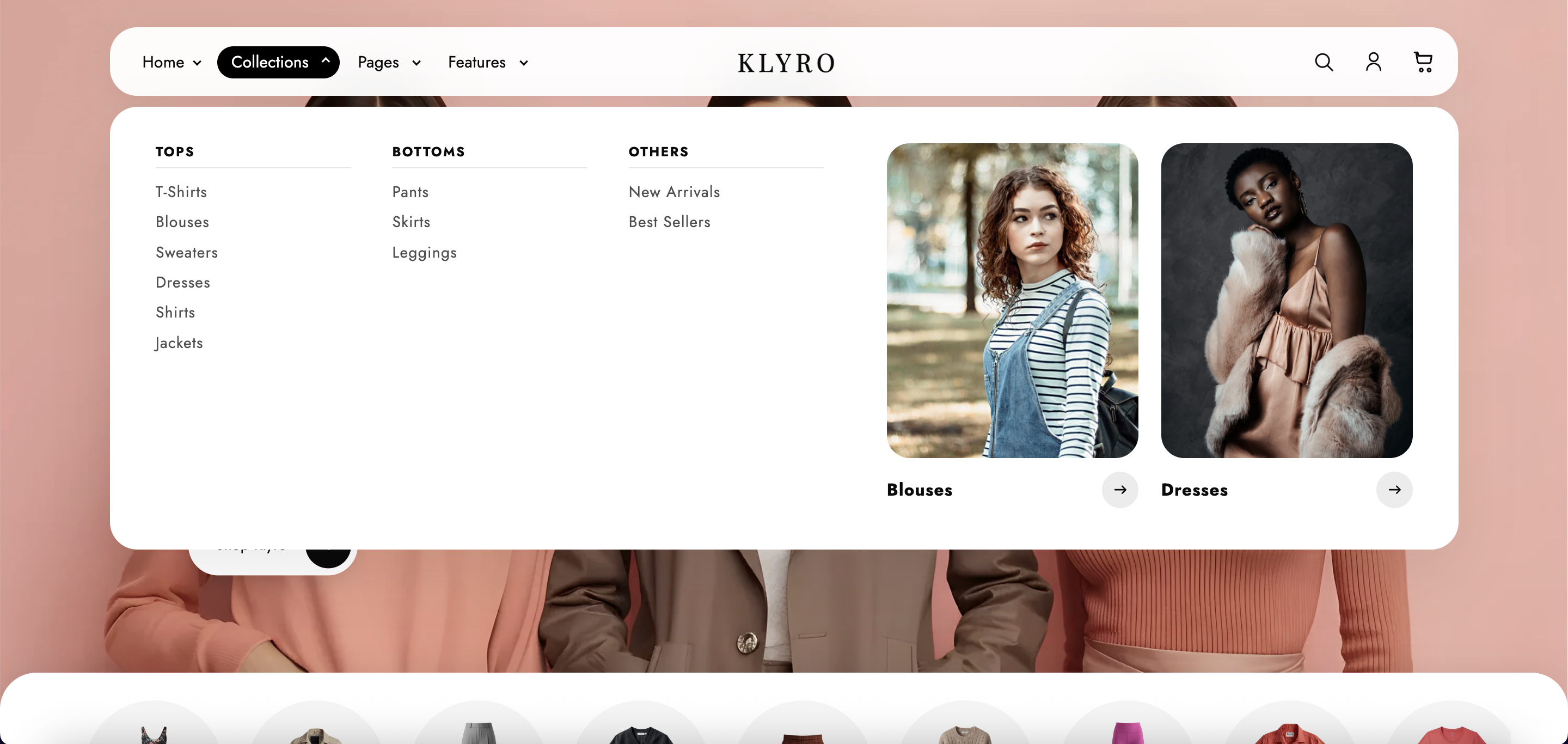
| Setting | Options |
|---|---|
| Desktop nav source | Shopify menu or custom link blocks |
| Menu type (desktop) | Dropdown, Mega menu, Drawer |
| Sticky header | None, On scroll up, Always, Reduce logo size |
| Floating desktop header | Pill-style header that expands on scroll |
| Overlay mode | Transparent header on homepage and collection pages |
| Search | Placeholder text, popular searches, featured collection grid |
| Notifications hub | Store announcements for logged-in customers |
The optional utility bar sits above the header and supports announcement links, social icons, and country/language selectors. Enable it in Header group → Utility bar.
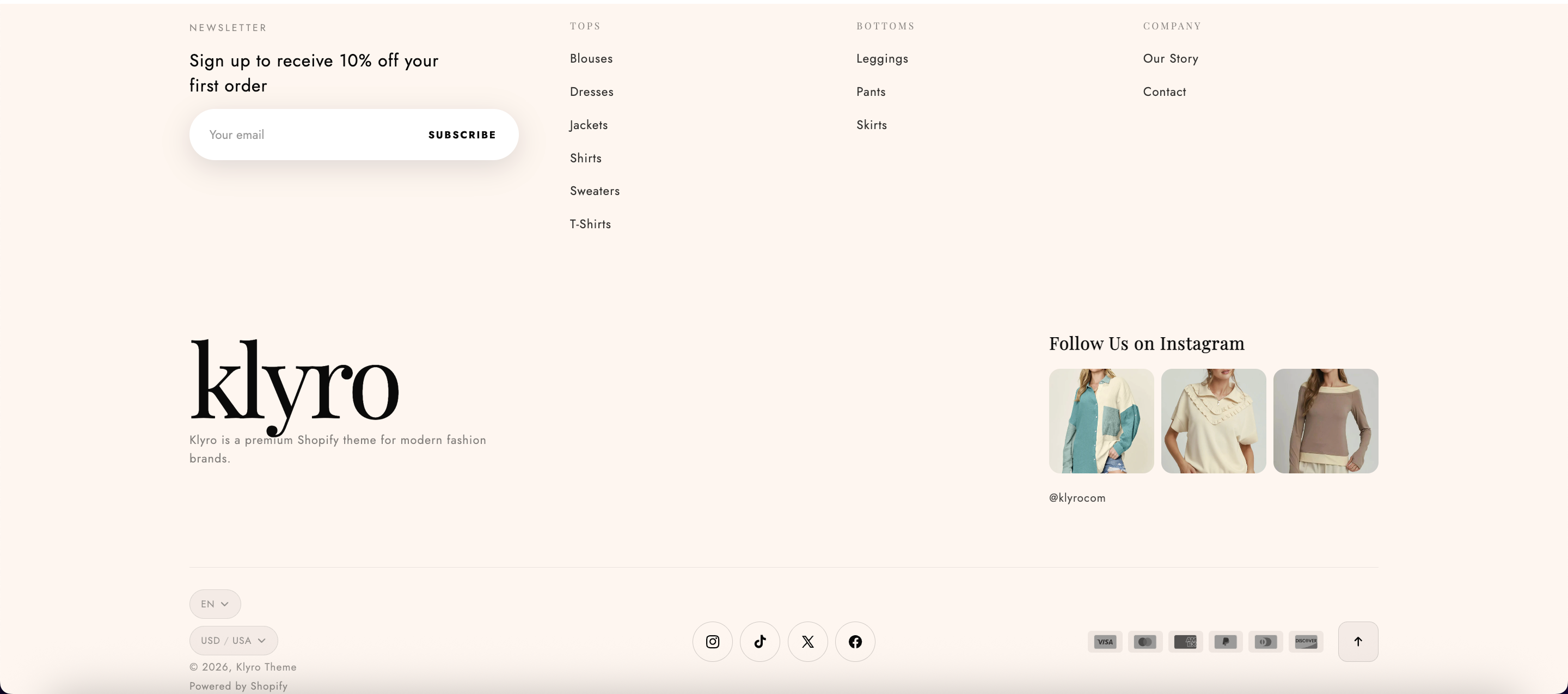
The Klyro footer combines newsletter signup, brand identity, navigation columns, and social proof.
Klyro offers three product page layouts, each optimized for different catalog styles.
2-column gallery grid. Best for lookbook-style product photography.
Stacked full-width images. Best for detailed product shots.
Horizontal scroll gallery. Default layout, best for mobile.
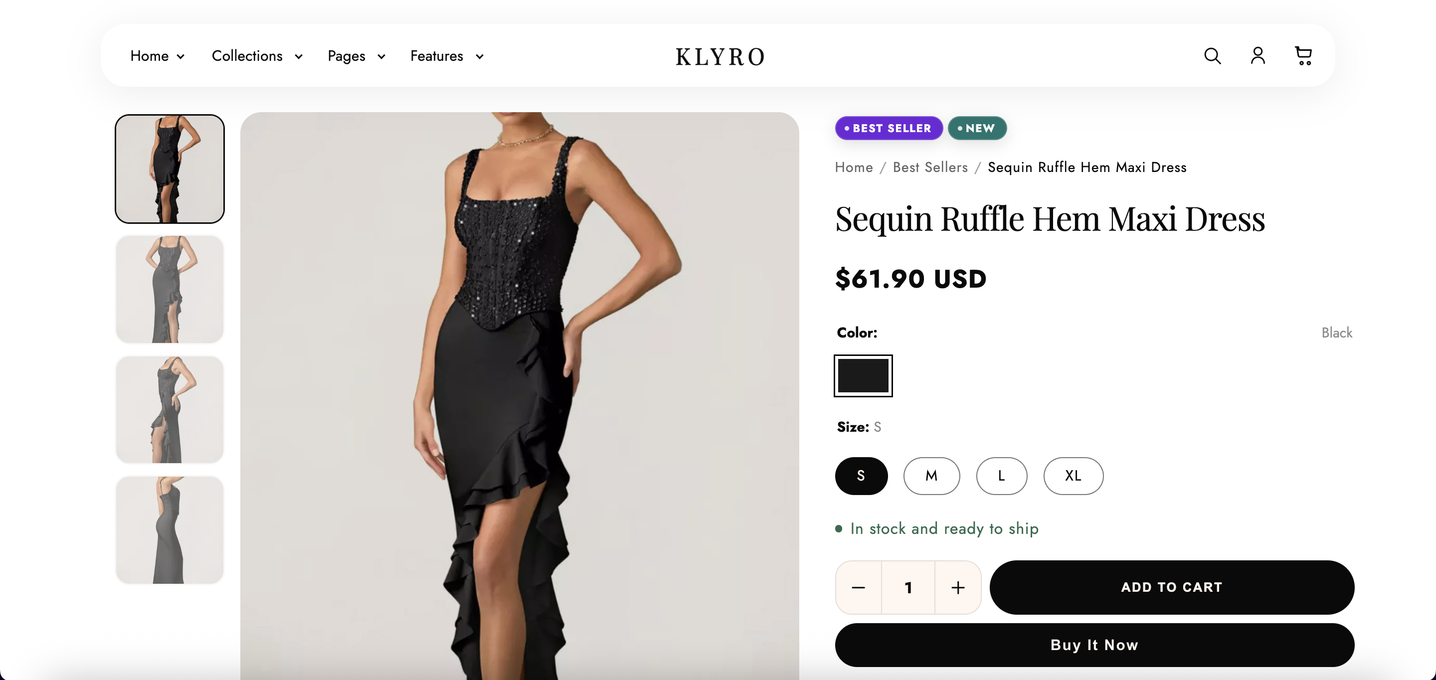
Klyro uses optional product metafields for accordion content, trust notes under Add to cart, and extra product attributes. Installing the theme does not create these definitions automatically — add them once in Shopify Admin, then fill values per product.
klyro_product_details, klyro_materials, and klyro_shipping_returns. The theme falls back to the product description or section defaults when a metafield is empty.
Do this once per store. Repeat for each metafield in the reference table below.
custom. Key must match exactly — e.g. klyro_product_details (no spaces, all lowercase).For custom.klyro_arm_length_type, after choosing Single line text, you can optionally limit values to: Long sleeve, Short sleeve, Sleeveless, Three-quarter sleeve.
| Namespace | Key | Full ID | Admin type | Used for |
|---|---|---|---|---|
custom | klyro_product_details | custom.klyro_product_details | Rich text | Product Details accordion (overrides product description when set) |
custom | klyro_materials | custom.klyro_materials | Rich text | Materials accordion |
custom | klyro_shipping_returns | custom.klyro_shipping_returns | Rich text | Shipping & Returns accordion |
custom | klyro_trust_shipping | custom.klyro_trust_shipping | Single line text | Trust note under Add to cart (e.g. “Free shipping over $100”) |
custom | klyro_trust_returns | custom.klyro_trust_returns | Single line text | Trust note under Add to cart (e.g. “Easy 30-day returns”) |
custom | klyro_color | custom.klyro_color | Single line text | Primary color or colorway label (e.g. Black, Ivory) |
custom | klyro_material | custom.klyro_material | Single line text | Material composition (e.g. 100% organic cotton) |
custom | klyro_arm_length_type | custom.klyro_arm_length_type | Single line text | Sleeve length (optional preset values — see Step 1) |
Add the Product trust bar section below the main product section. It displays icon badges (shipping, returns, secure payment, etc.) in a responsive row — on mobile it becomes a swipeable slider.
The Klyro collection page includes a hero banner, Shopify filtering, sticky toolbar, and sidebar collection navigation.
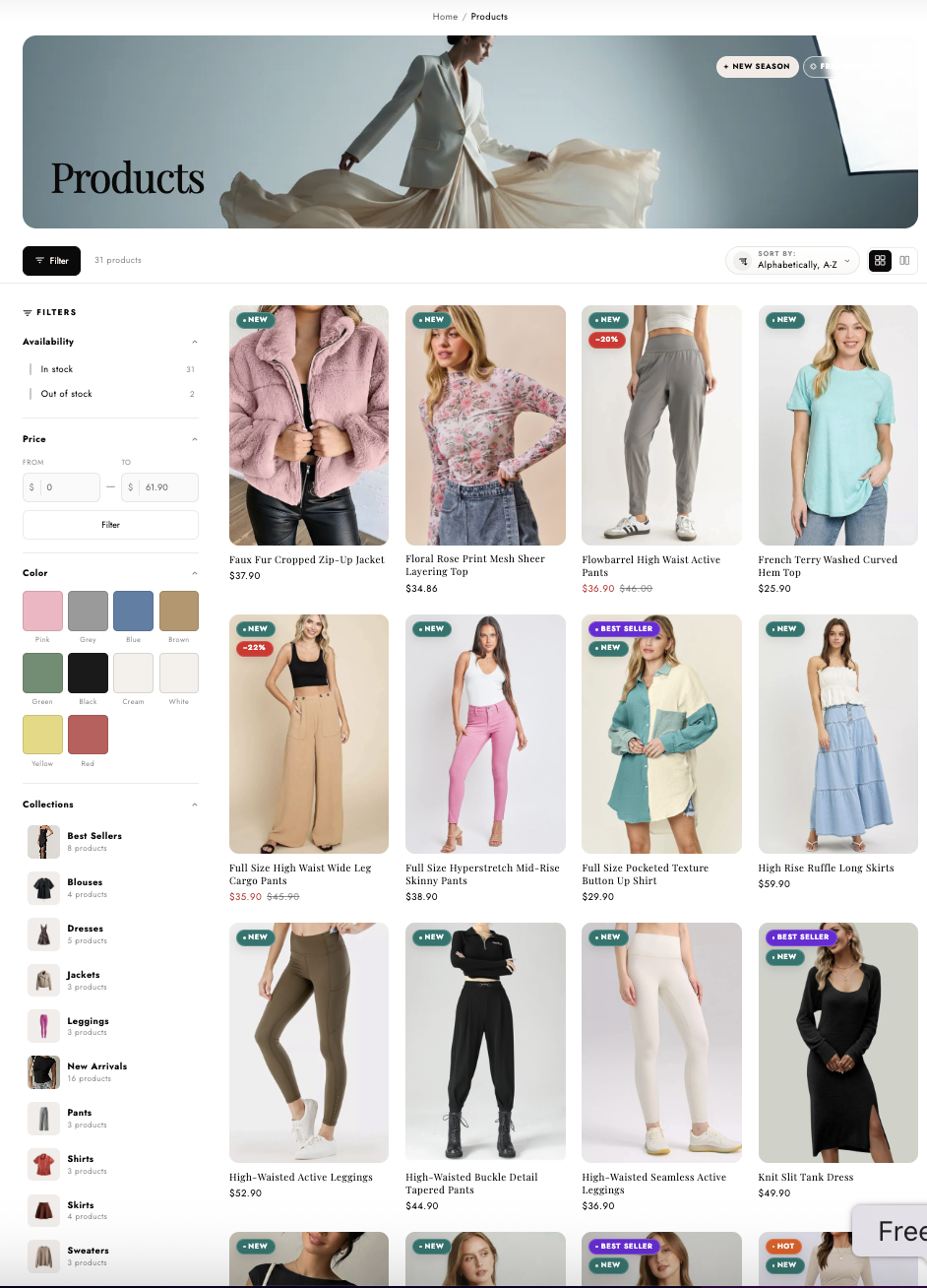
Klyro supports three cart modes configured in Theme settings → Cart.
| Mode | Behavior |
|---|---|
| Drawer (default) | Slide-in cart panel from the right. Updates via AJAX without page reload. |
| Page | Dedicated /cart page with hero, empty state, and collection shortcuts. |
| Notification | Toast notification on add-to-cart; cart accessible via header icon. |
Klyro includes predictive search in the header drawer and a full search results page.
The Klyro mega menu displays multi-column navigation with optional promotional banners and product cards.
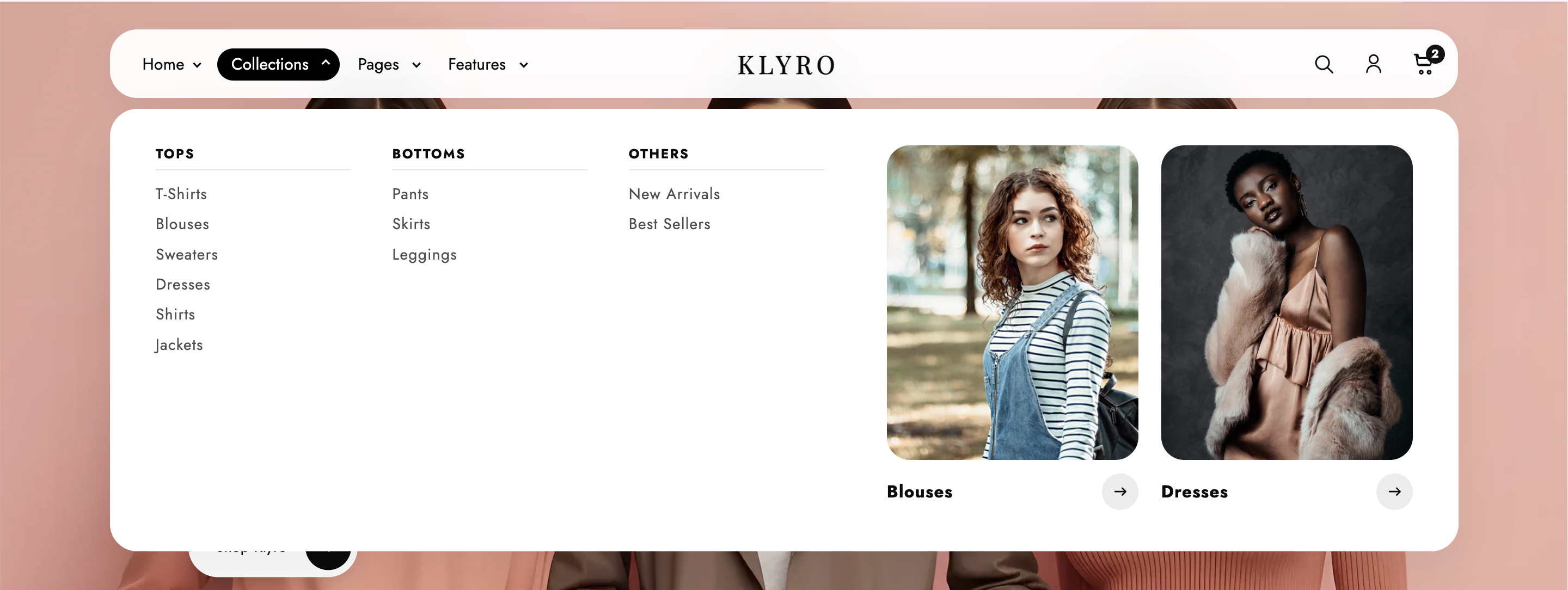
| Block | Fields |
|---|---|
mega_menu | 2 promo banners — image, heading, link (collection/product/page) |
mega_promo_card | Single promo card — product or collection, image override, label |
Klyro is built with performance as a priority. All optimizations are enabled by default.
All theme scripts load with defer. No render-blocking JS.
Images below the fold use loading="lazy" with responsive srcset.
Custom fonts use font-display: swap with preload for non-system fonts.
Cart drawer CSS only loads when cart type is set to drawer.
Klyro includes built-in SEO features. Additional optimization is done through Shopify Admin.
theme.liquidklyro-meta-tags snippetKlyro supports Shopify app blocks and key platform integrations.
| Integration | How to Use |
|---|---|
| Shopify Search & Discovery | Install app → configure filters → filters appear on collection page automatically |
| App blocks | Add via @app blocks in Header, Product, and Apps sections |
| Shopify Markets | Country/language selectors in header utility bar and footer |
| Shop Pay / Accelerated checkout | Dynamic checkout buttons on product page (enable in Shopify Admin → Payments) |
| Product reviews apps | Install any reviews app → add app block to product template |
| Klaviyo / Mailchimp | Replace newsletter form action in footer/newsletter section settings |
| Google Analytics / GTM | Add via Shopify Admin → Online Store → Preferences → Analytics |
In the theme editor, select the homepage template. Add, remove, or reorder sections using the left sidebar. Each section has its own settings panel.
Go to Online Store → Themes → Customize → navigate to any product page. In the top template picker, select product.v1, product.v2, or product.v3. Or assign templates per product in Admin → Products → [Product] → Theme template.
See the Mega Menu section. Set Desktop menu type to Mega menu in Header settings, then add promo blocks.
Automatic badges (sale, new, limited) are configured in Theme settings → Klyro product badges. Manual badges use product tags: new, hot, popular, bestseller.
Go to Settings → Custom data → Products and create each definition with namespace custom and the exact keys from the Product Metafields reference table. Then fill values on each product under Products → [Product] → Metafields. The theme does not create these definitions when you install it.
Theme settings → Cart → Enable free shipping bar → set threshold amount (in your store currency, without decimals for cents — e.g. 100 for $100.00).
Yes. While optimized for clothing & fashion, all sections and settings work for any product catalog. Disable fashion-specific sections (lookbook, compare spotlight) if not needed.
See the full guide in Updating Klyro. In short: duplicate your theme, click Update in the theme library, preview, then publish.
Fixed in v1.0.0. If you see white text on white background in the collection sort dropdown on Windows, update to the latest theme version.
First, confirm the metafield definitions exist under Settings → Custom data → Products (namespace custom, keys and types as listed in Product Metafields). Then fill values on the product under Products → [Product] → Metafields. If metafields are empty, the theme uses the product description or section fallbacks. You can also add content directly in the accordion block in the theme editor.
Install the Shopify Search & Discovery app and configure filters under Admin → Search & Discovery → Filters. Enable filtering in the Collection Page section settings.
Verify Theme settings → Cart → Cart type is set to Drawer. Clear browser cache and test in an incognito window.
Add mega_menu or mega_promo_card blocks in the Header section. Ensure Desktop menu type is set to Mega menu.
This is intentional — Klyro uses a transparent overlay header on the homepage. The hero section accounts for header height automatically. If content is hidden, check that the Lookbook Hero section is the first section on the homepage.
Visit our Support page or email support@klyrothemes.store.
When a new version is released (e.g. v1.0.0 → v1.1.0), you can update safely without losing your products, collections, or theme editor customizations.
| Your work | After update |
|---|---|
| Products, collections, inventory | ✅ Unchanged — stored in Shopify Admin |
| Orders, customers, discounts | ✅ Unchanged |
| Theme settings (colors, fonts, cart) | ✅ Usually preserved |
| Section order & block content (theme editor) | ✅ Usually preserved |
| Navigation menus & pages | ✅ Unchanged |
| Custom code edits (Edit code → .liquid / .css) | ⚠️ May be overwritten — back up first |

One-click backup. Publish the duplicate if the update causes issues.
Preview the updated theme. Use Shopify's share link to test on mobile.
Each release notes new features, fixes, and any required merchant actions.
Use theme editor settings and Custom Liquid blocks — they survive updates better.